
4.9 on Clutch
Ideas & Insights
-
 Maryna Medushevska
Software Development with Python: A Practical Guide for Decision-Makers

-
 Maryna Medushevska
The Guide to Python Development Outsourcing (The Only One You Need)
-
 Maryna Medushevska
How to Build a Web Application: The Complete Guide
-
 Maryna Medushevska
How to Build a CRM: a Complete Guide to Types, Features, and Development
-
 Maryna Medushevska
How to Build a SaaS Product: Everything You Need to Know (and Do)
-
 Maryna Medushevska
How Much Does AI Cost to Build? A Practical Guide for Decision-Makers
-
 Maryna Medushevska
How to Build a Banking App: From Planning to Launch
-
 Maryna Medushevska
Reimagining Banking With Cloud Solutions: Uses, Benefits, and Tips
-
 Maryna Medushevska
Your Complete Guide to Creating an On-Demand App
-
 SYNDICODE Marketing
Using DeepSeek AI to build an app: What it can (and can’t) do
-
 Maryna Medushevska
Should you choose WordPress for your business website in 2025? Syndicode’s insights
-
 Maryna Medushevska
Dedicated development team: what it is, when to use it, and why it works
-
 Maryna Medushevska
Discovery session for a new project. The what, why, and your role as a client
-
 Maryna Medushevska
Managed IT services 101: Benefits and choosing the right solution
-
 Maryna Medushevska
The guide to travel app development: How to create a successful travel app from scratch?
-
 Maryna Medushevska
Enhancing the language learning platform with Gen AI: ChatGPT integration use case
-
 Maryna Medushevska
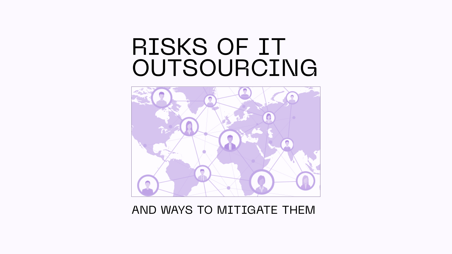
Critical risks of IT outsourcing and ways to mitigate them
-
 Maryna Medushevska
How to build a machine learning app? The guide to ML app development for web and mobile
-
 Maryna Medushevska
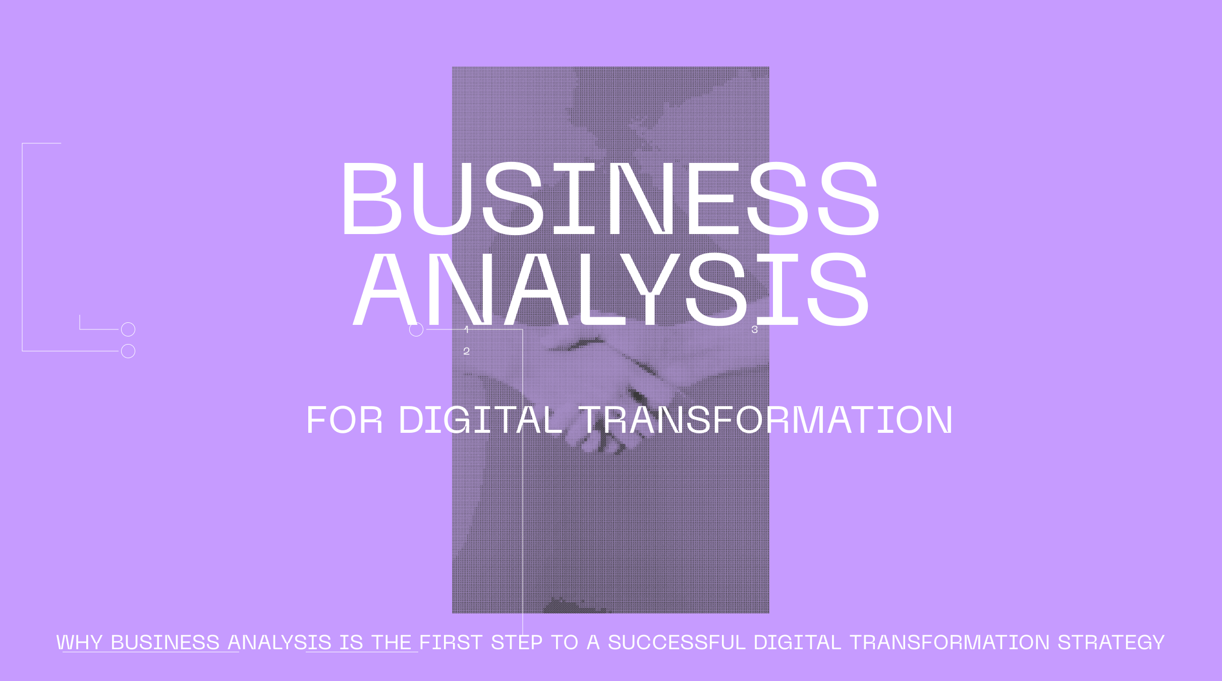
Why business analysis is the first step to a successful digital transformation strategy?
-
 Maryna Medushevska
The future of retail: Why businesses invest in smart retail, and how you can too?