4.9 on Clutch
FEATURED SUCCESS STORIES
-

Prefabrication Innovation Hub | USA
McCarthy Building Companies
-
Digital Mortgage Platform | USA
Maxwell
-
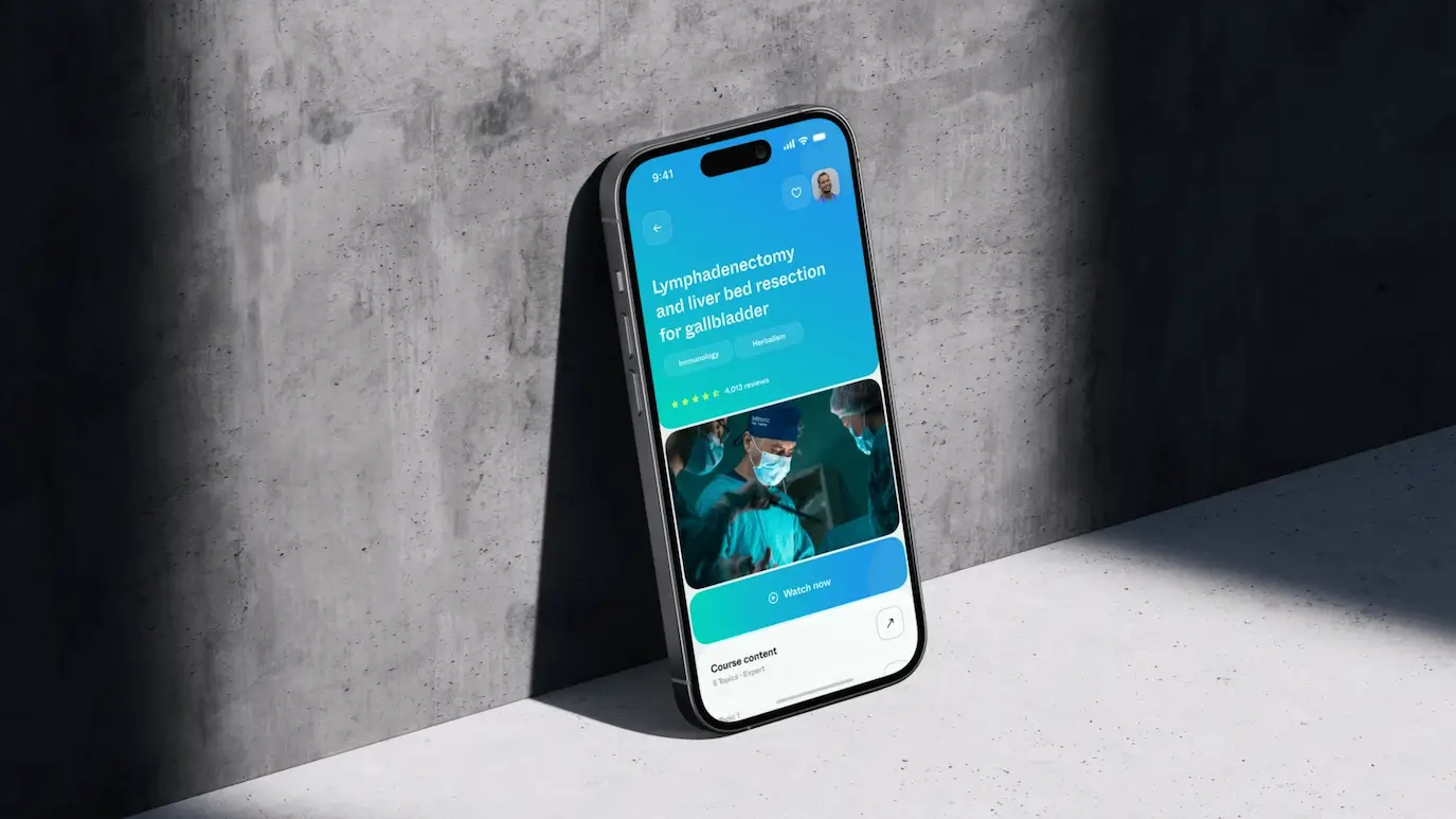
E-learning Medical Platform | Austria
MedYouCate
-
Roadtrip Planning Web App | Australia
Harvest Inn
-
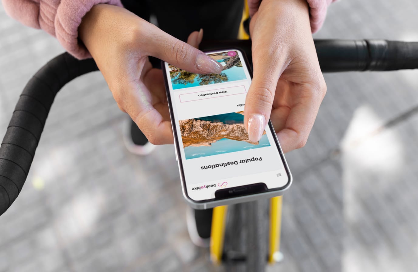
Bike Rental Marketplace | Austria
BookYaBike
-
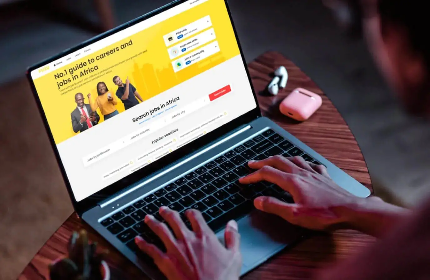
Employment Platform | Finland
Fuzu
-
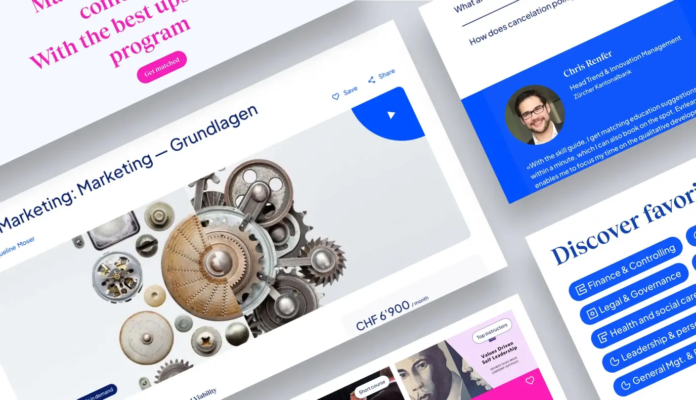
Educational Marketplace | Switzerland
Evrlearn
-
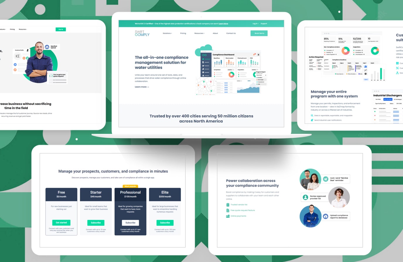
Compliance Manager Software | USA
Swift Comply
-
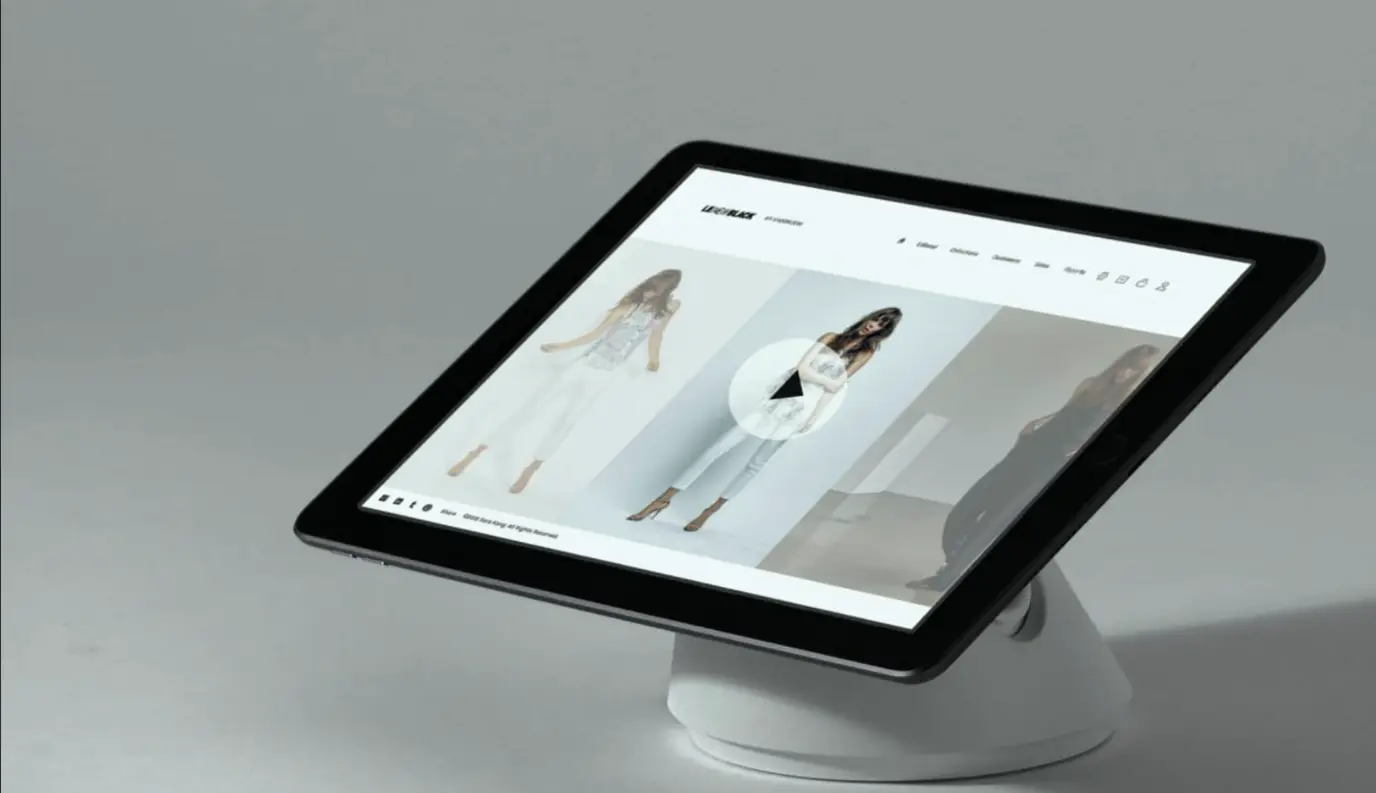
Fashion Retail iOS App | France
Le New Black
-
Social Networking Tool | Australia
InstaLinks
-
Fashion Resale Marketplace | USA
Thredup
-
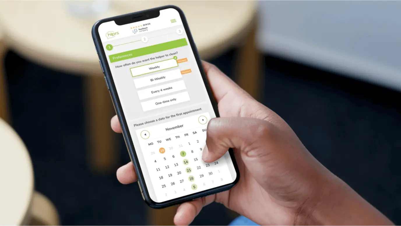
Household Service | Netherlands
HLPRS Marketplace
-
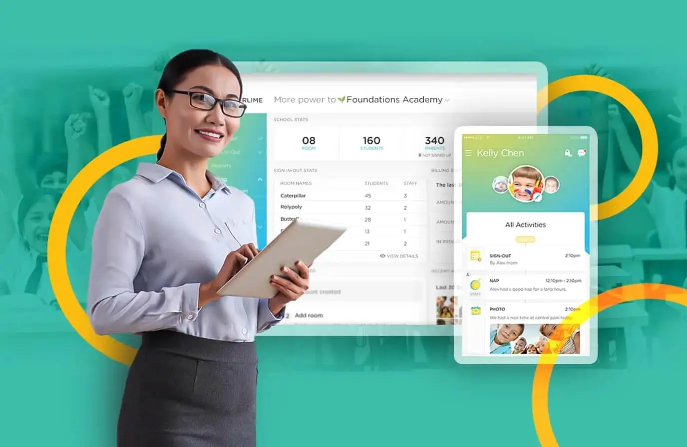
Childcare Management App | USA
Procare (ex. Kinderlime)
-
Global Relocation Platform | Germany
Movinga
-
API Management & Support Portal
Nova Post